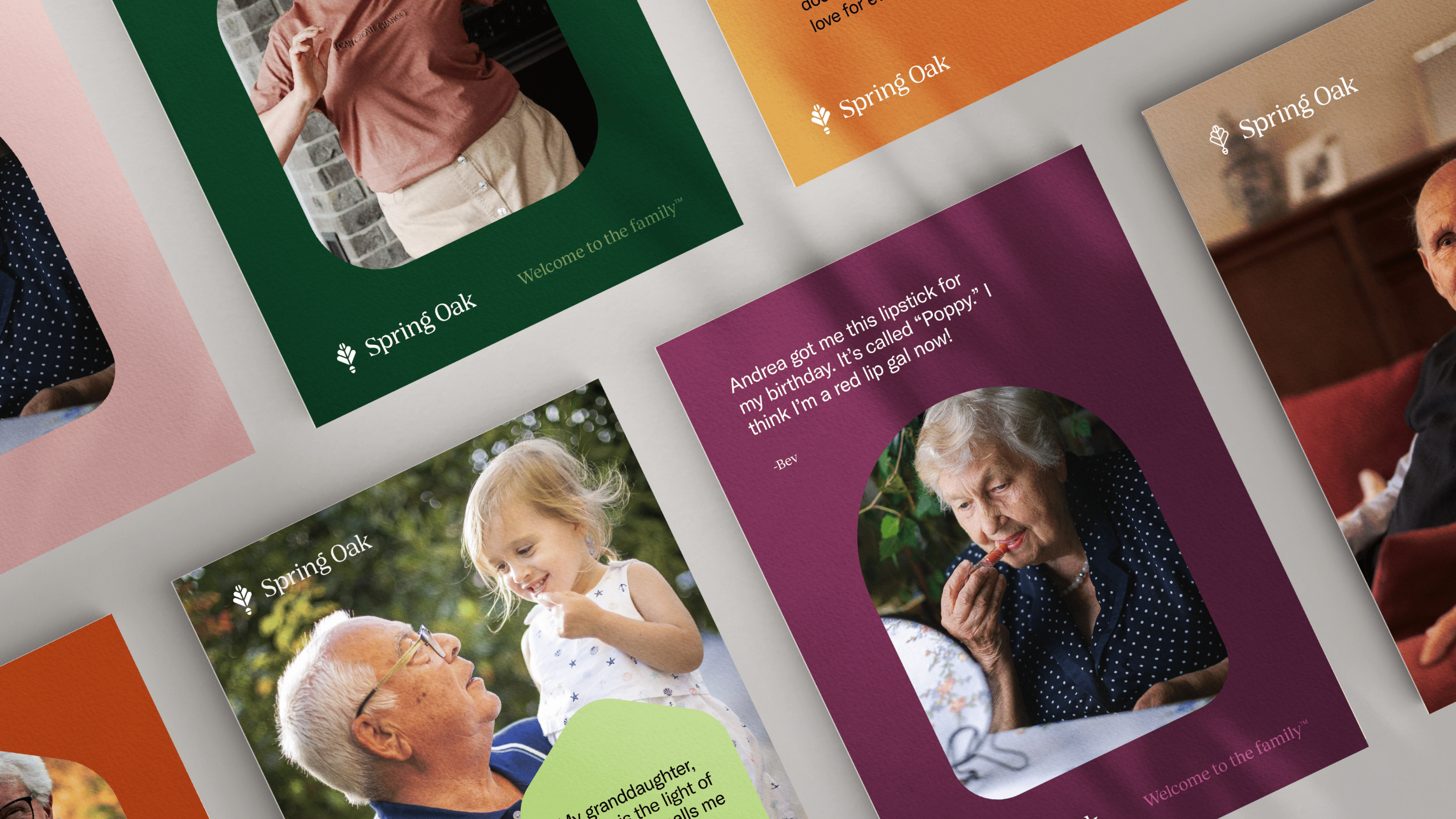
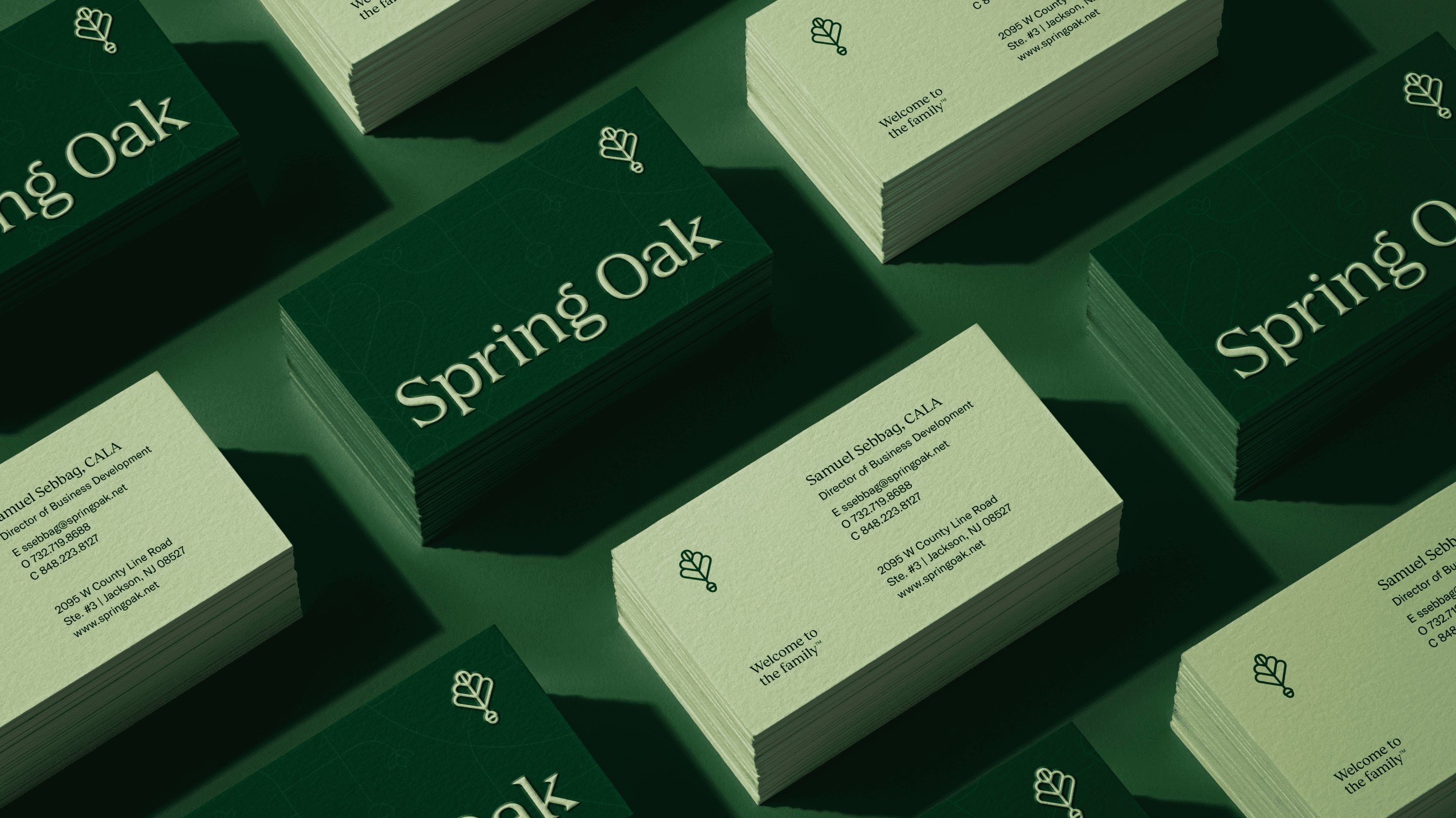
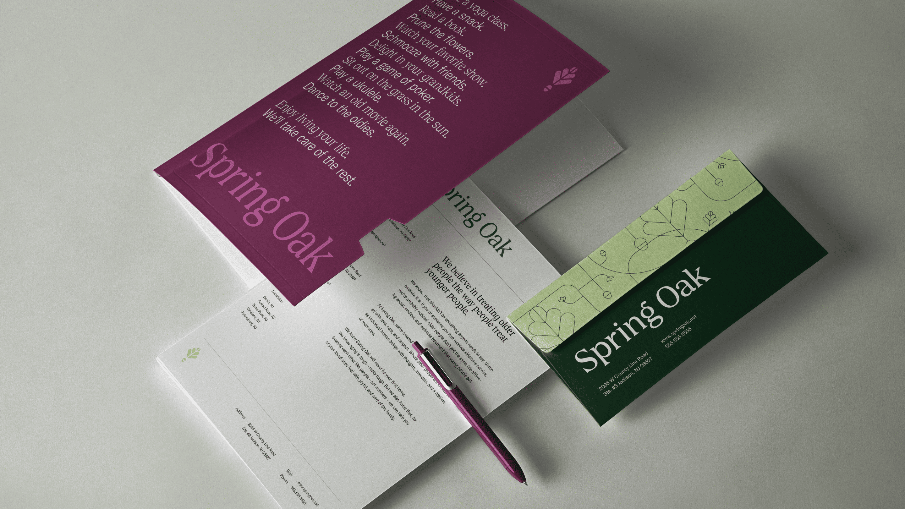
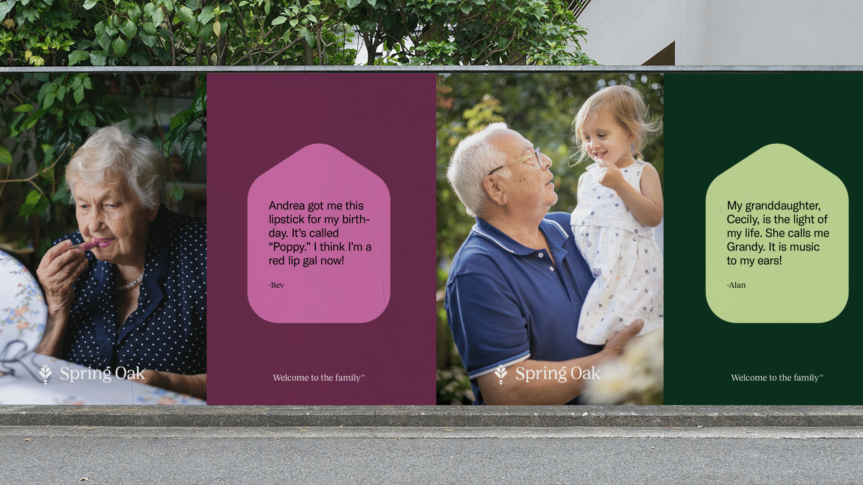
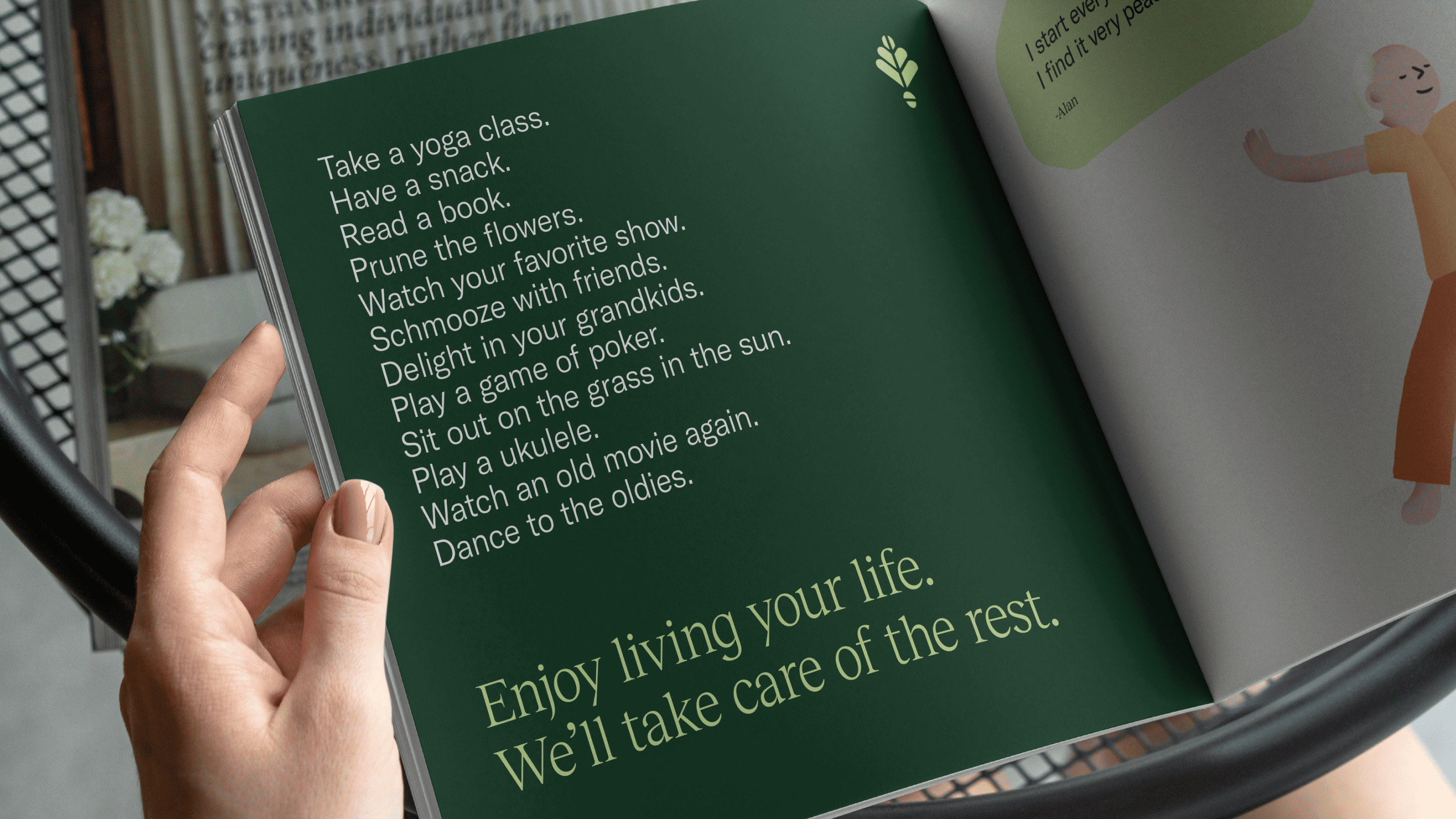
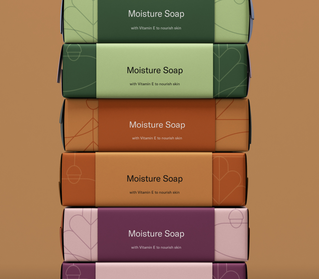
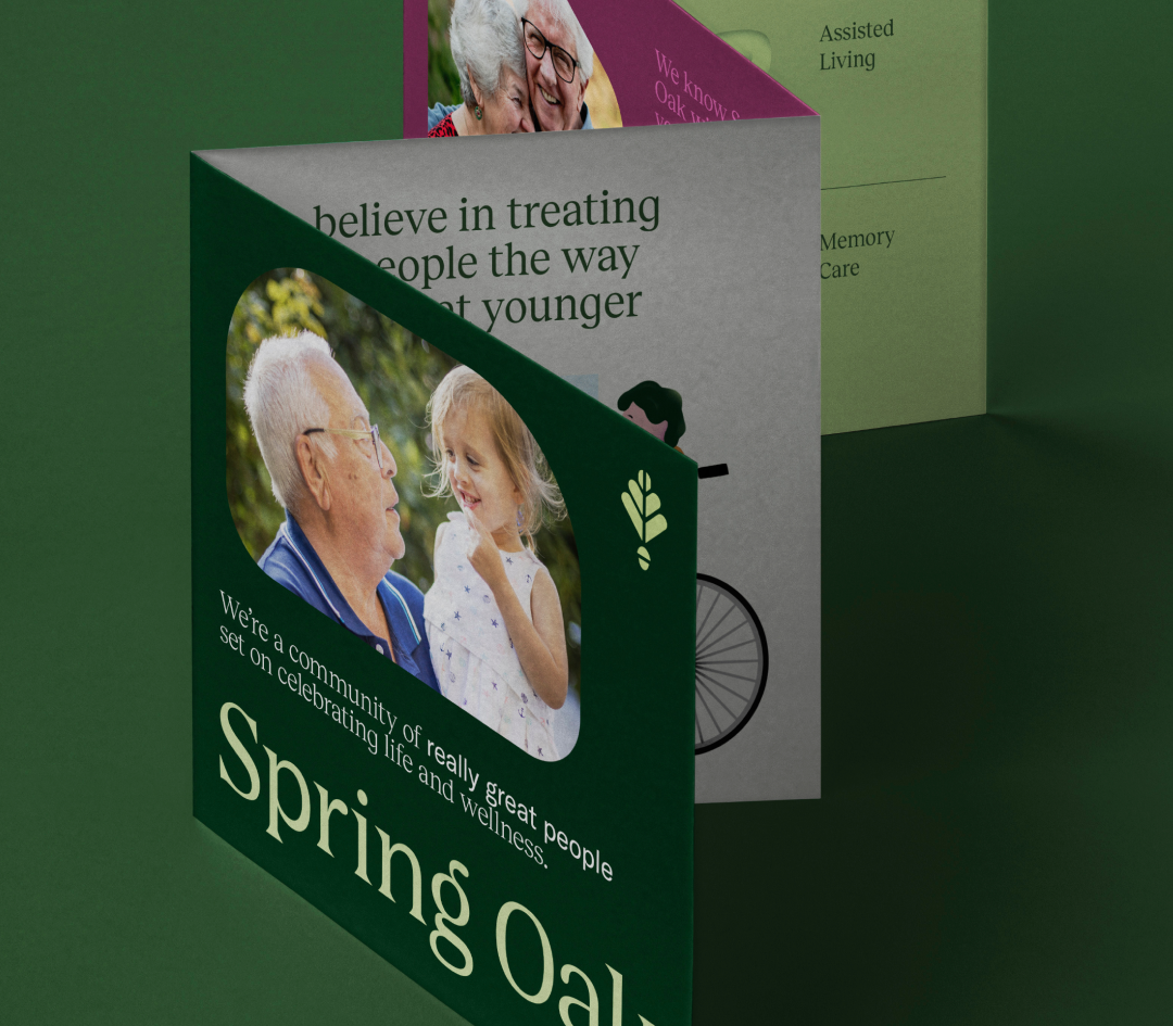
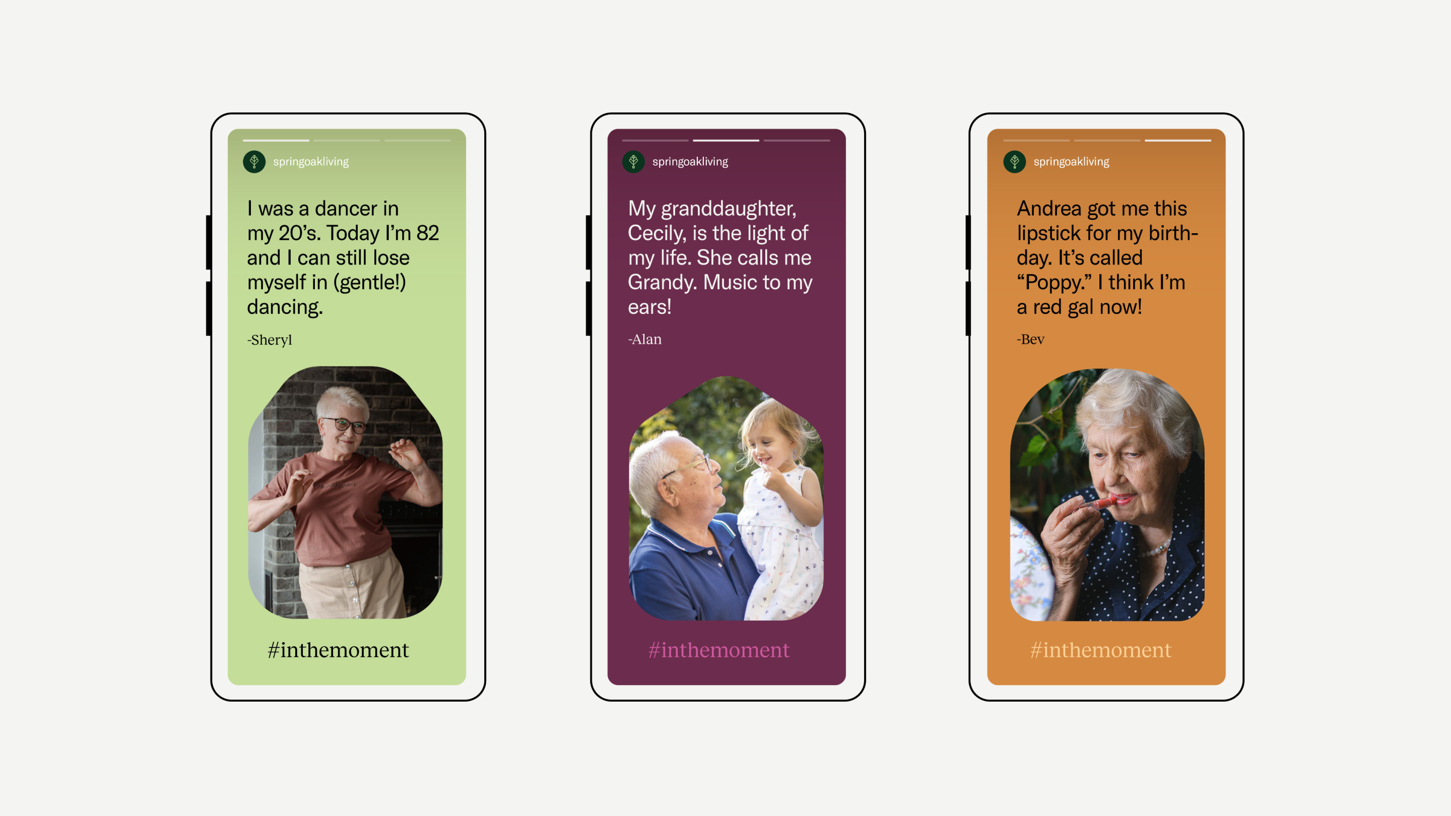
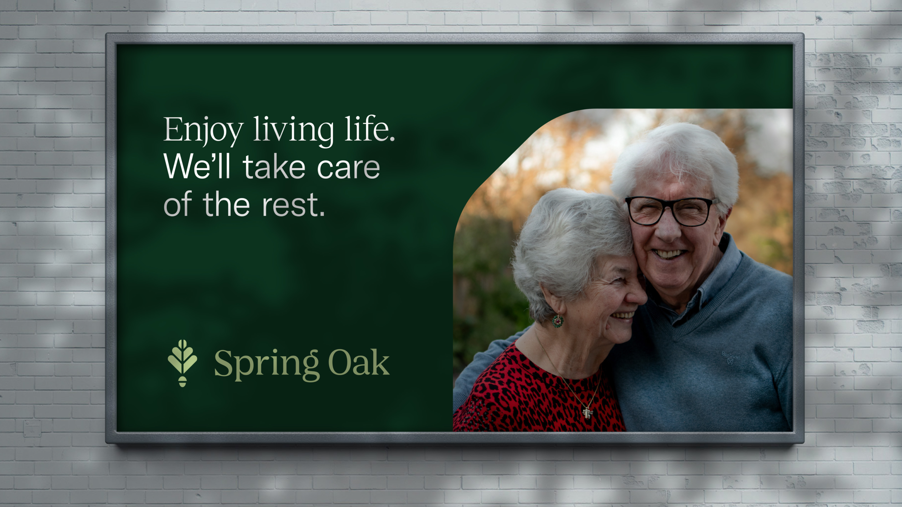
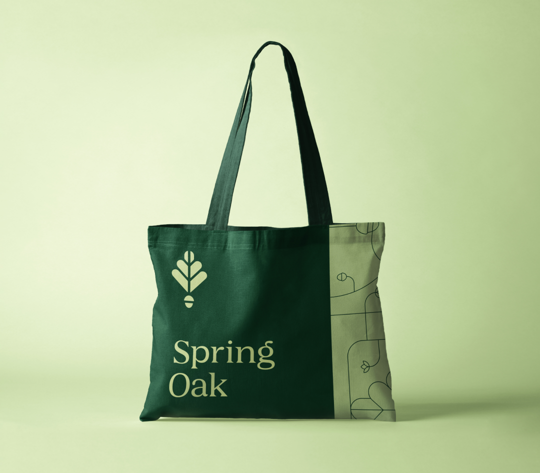
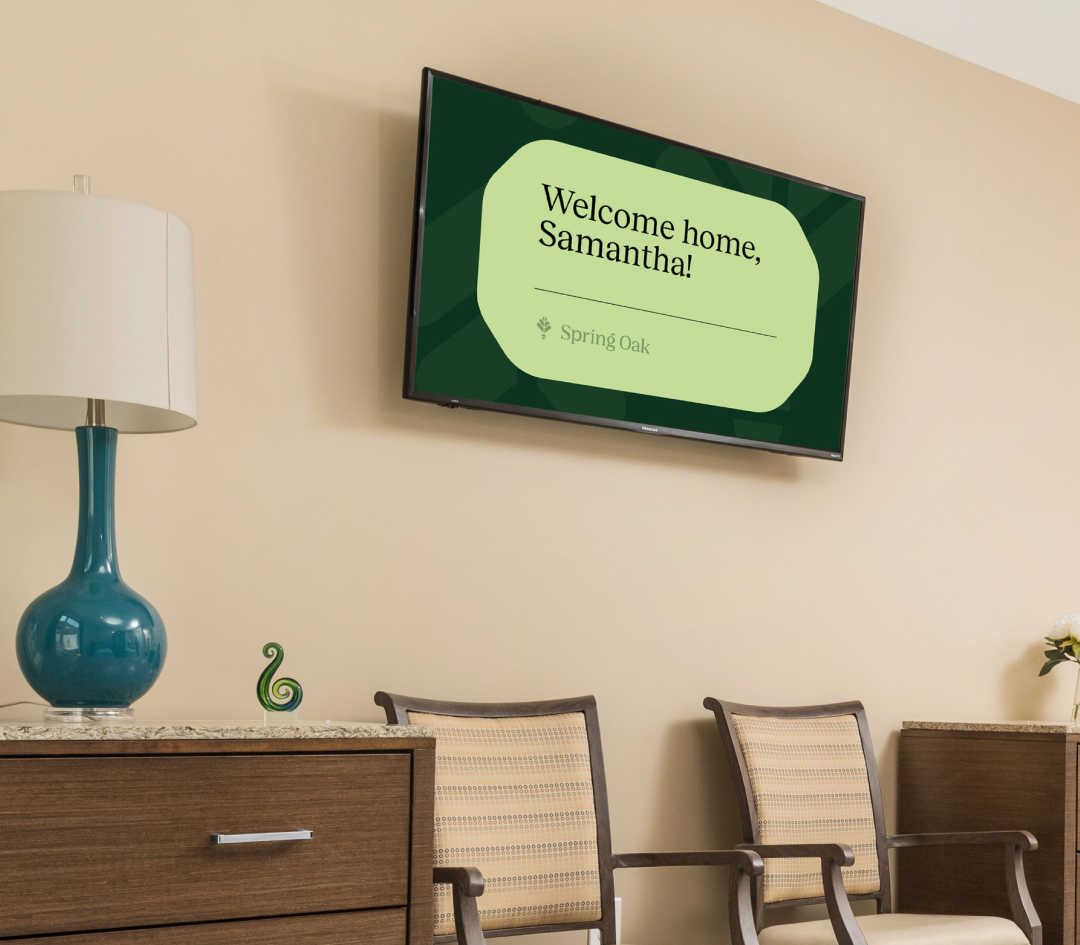
With an ever-expanding portfolio of senior living homes across the East Coast, Spring Oak doesn’t just provide older folks with a place to live – they’re offering heart. The eldercare industry is notorious for seeing its patients as numbers. At Spring Oak, the team would rather take a paycut than treat one of their residents with anything but integrity, honesty, and compassion. In the rebrand, we doubling down on this human-first attitude, bring youthfulness and modern vibrance in, and ensuring every inch of Spring Oak is welcoming, joyful, and full of life.
familial
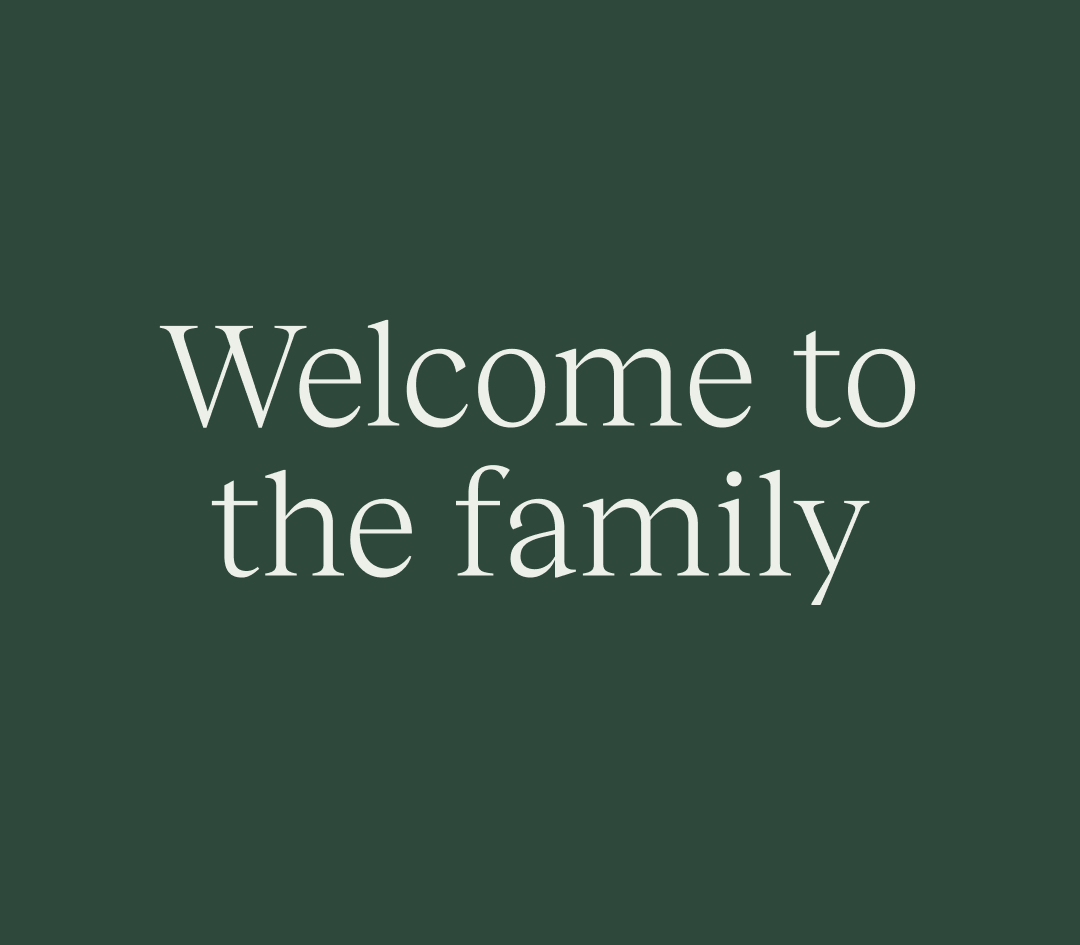
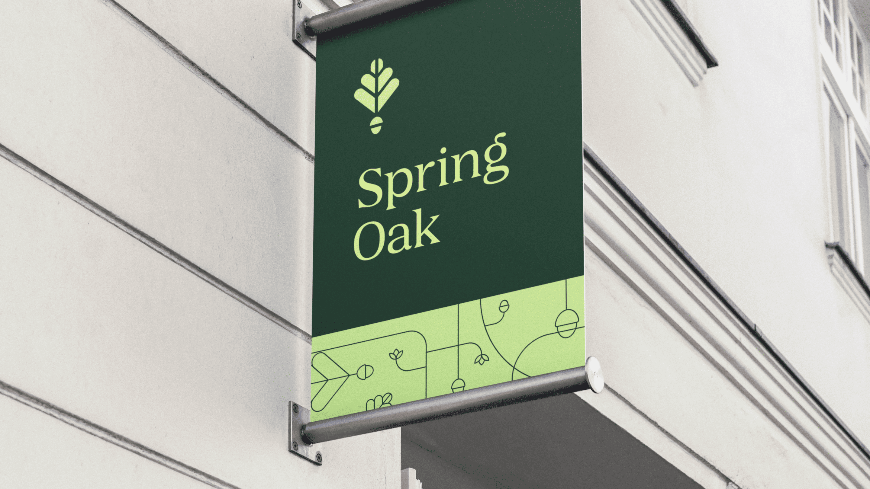
Fear of dreary, depressing environments keep prospects from making the move for their loved ones. A family-owned, family-style company, Spring Oak's new messaging highlights their incredibly warm, supportive environment, always-down-for-a-schmooze team, and the way they truly view each resident as a person with a story. The heart motif tucked into their new spring leaf-and-acorn icon doubles down on it!
safe
We balanced the friendly, joyful visuals with a touch of serious professionalism to underscore Spring Oak's stellar reputation for trustworthiness. Understanding the profound trust residents need to place loved ones in an assisted living community, we emphasized that safety, care, and professionalism through the corporate logo, messaging, and design.
the website experience
With more than ten locations on the East Coast, Spring Oak needed a strong and simple solution for managing each location's website. We built a custom Wordpress template that could be applied over and over, giving each location its unique flavor and local charm.


.svg)